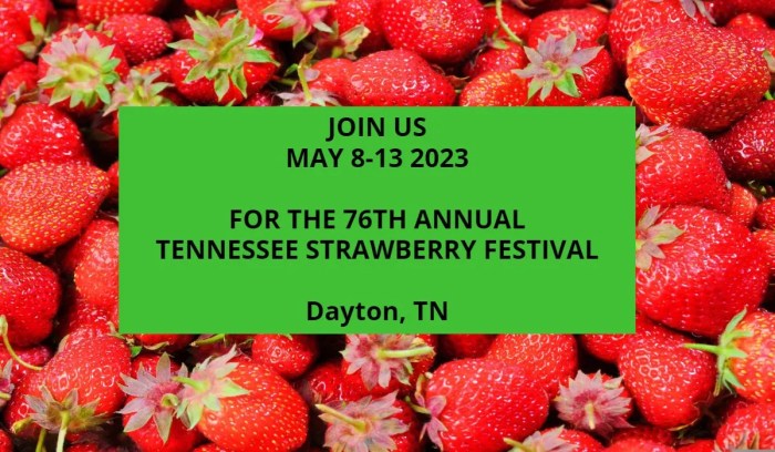
Festival Poster design is more than just slapping some text and images onto a page; it’s about crafting a visual experience that captures the essence of the event. A killer festival poster needs to grab attention, convey the event’s vibe, and provide essential information—all while looking amazing. This guide dives deep into every aspect of festival poster creation, from initial concept to final print, ensuring your poster is a work of art that effectively promotes your event.
We’ll explore design elements like color palettes, typography, visual hierarchy, and imagery, showing you how to create a poster that’s both visually stunning and highly informative. We’ll also cover crucial aspects like choosing the right paper stock, effective printing techniques, and smart distribution strategies. Whether you’re a seasoned designer or a complete beginner, this guide provides the knowledge and inspiration to create a festival poster that’s truly unforgettable.
Informative Content on Festival Posters

Creating a killer festival poster isn’t just about slapping some band names on a colorful background. It’s about strategically conveying crucial information and crafting a visual experience that excites potential attendees and accurately reflects the festival’s vibe. Think of your poster as the first impression – you want it to be memorable, informative, and ultimately, persuasive.
Essential Information for Festival Posters
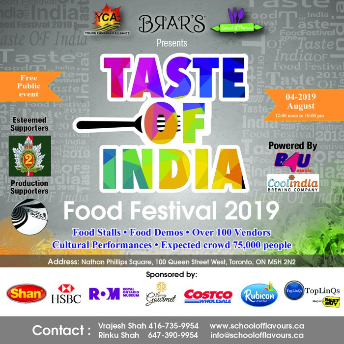
A well-designed festival poster needs to communicate key details efficiently. Here’s a table outlining the must-have information, organized for optimal readability and visual impact:
| Category | Information | Example | Considerations |
|---|---|---|---|
| Festival Name | The name of your festival, clearly and prominently displayed. | “Summer Sounds Fest” | Use a memorable and evocative font. |
| Dates | Start and end dates of the festival. | July 28th – 30th | Use a clear and easily readable font size. |
| Location | Venue name and address, or a general location if applicable. | “Central Park, New York City” | Include a map if the location is complex. |
| Performers | List of headliners and key performers. | “Featuring: The Headliners, DJ Spin, Local Legends” | Prioritize the most well-known acts. |
| Ticket Information | Pricing, where to buy tickets (website, box office), and any early bird discounts. | “Tickets: $50 (GA), $100 (VIP)
|
Make this information highly visible. |
| Website/Social Media | Links to your festival website and social media pages. | “[Website Address] | [Social Media Handles]” | Use QR codes for easy access. |
| Sponsors/Partners | Logos of sponsors and partners (if any). | [Space for logos] | Ensure logos are appropriately sized and positioned. |
| Artwork/Visuals | Images or illustrations that capture the festival’s atmosphere. | [Description: A vibrant image depicting people enjoying the festival, with a silhouette of the stage in the background.] | High-quality images are crucial. |
Targeting Your Audience Visually
Your poster’s design should immediately communicate the festival’s target audience. A heavy metal festival will have a drastically different aesthetic than a family-friendly folk music event. For example, a poster for a young adult electronic music festival might feature bold, geometric shapes, vibrant neon colors, and a dynamic, almost abstract layout.
Conversely, a poster for a classical music festival might use elegant typography, sophisticated color palettes, and imagery that evokes a sense of refinement and tradition.
Conveying Festival Atmosphere and Genre
Using concise and evocative language is key. Instead of simply stating “Rock Music Festival,” try something like “Unleash the Fury,” “Raw Power,” or “Epic Rock Anthems.” For a jazz festival, you could use phrases like “Smooth Grooves,” “Jazzy Nights,” or “A Night of Soulful Sounds.” The choice of font also plays a crucial role; a bold, aggressive font might suit a rock festival, while a more elegant script might be appropriate for a classical music event.
Presenting Pricing Information Clearly and Attractively
Pricing should be prominent but not overwhelming. Use clear, concise language. Instead of “Tickets are $40,” try “General Admission: $40” or “Early Bird Tickets: $30 (until [date])”. Highlight any special offers or discounts, such as group rates or VIP packages, to incentivize purchases. Consider using color-coding to differentiate pricing tiers.
Incorporating Sponsor Logos Effectively
Integrating sponsor logos requires careful planning. Don’t just cram them in; find a visually appealing way to incorporate them. Consider placing them in a designated area, such as a footer or sidebar. Ensure the logos are appropriately sized and don’t detract from the overall design. Using a consistent style guide for logo placement and size will maintain visual harmony.
For instance, you might place larger logos of major sponsors prominently, while smaller logos of supporting partners could be grouped together in a designated section.
Visual Styles and Trends in Festival Posters

Festival posters are more than just advertisements; they’re vibrant snapshots of musical culture, reflecting the genre’s ethos and attracting the right audience. A well-designed poster can be the difference between a successful festival and one that struggles to fill its venues. The visual style employed significantly impacts a poster’s effectiveness, drawing on established conventions while also embracing innovative trends.
Visual Styles Across Music Genres
The visual language of a festival poster often aligns closely with the music genre it represents. Rock festivals frequently utilize bold typography, gritty imagery (think ripped posters or distressed textures), and a raw, energetic aesthetic. Electronic music festivals, conversely, tend toward a more sleek, futuristic style, employing clean lines, vibrant gradients, and abstract shapes that convey a sense of movement and technological advancement.
Folk festivals often lean towards a more organic, hand-drawn aesthetic, using earthy tones, illustrative elements, and a focus on natural imagery to evoke a sense of community and connection to nature. These stylistic differences effectively target the specific demographics and expectations associated with each genre.
Current Trends in Festival Poster Design
The landscape of festival poster design is constantly evolving. Three prominent current trends are the increased use of bold, geometric shapes, the resurgence of retro styles, and the incorporation of interactive elements (though this is largely limited to digital posters).The use of bold geometric shapes creates visually striking and memorable posters. Think large, overlapping triangles, squares, and circles in vibrant, contrasting colors.
This style is effective because it’s easily digestible, conveying a sense of energy and modernity. The simplicity of the shapes allows the typography and other design elements to stand out, further emphasizing the festival’s key information.The retro aesthetic, encompassing styles from the 1960s, 70s, and 80s, is experiencing a strong revival. This is largely due to a broader cultural fascination with nostalgia and vintage design.
Think bold color palettes, vintage typefaces, and imagery reminiscent of classic album art. The effectiveness of this trend lies in its ability to evoke a sense of familiarity and warmth, creating a connection with audiences who appreciate that specific era’s aesthetic.While less common in print, interactive elements in digital festival posters are gaining traction. These can include animations, embedded videos, or even augmented reality experiences.
The effectiveness of this approach lies in its capacity to engage audiences in a more dynamic and memorable way than a static image ever could. However, the success of this trend depends heavily on seamless integration and a user-friendly experience.
Artistic Styles in Festival Poster Design
Minimalist designs use limited colors and simple shapes to create a clean, uncluttered look. This approach prioritizes clarity and readability, making it highly effective for conveying essential information quickly and memorably.Retro styles, as discussed earlier, draw inspiration from past design eras, often incorporating vintage typography, color palettes, and imagery. This approach leverages nostalgia to create a sense of connection and familiarity with the target audience.Surreal designs use unexpected juxtapositions and dreamlike imagery to create a visually striking and memorable poster.
This style is particularly effective for festivals that aim to project a sense of mystery, innovation, or unconventionality.
Hand-Drawn Festival Poster Mock-up
Imagine a poster featuring a hand-drawn sketch of a whimsical forest scene, complete with fantastical creatures playing musical instruments. The style is loose and expressive, with visible pencil strokes and shading, giving it a rustic charm. The festival name, “Enchanted Grove Music Fest,” is written in a playful, handwritten font. The color palette is earthy, using greens, browns, and muted blues.
The process involved sketching the scene lightly with pencil, then inking the lines with a fine-liner pen. Watercolors were used to add subtle color and shading, and finally, the text was added using a brush pen. The overall effect is charming, whimsical, and evocative of a unique musical experience.
Creating a Digital Festival Poster Using Vector Graphics
Creating a digital festival poster using vector graphics involves a series of steps. First, conceptualize the design, sketching initial ideas. Next, use vector graphics software (like Adobe Illustrator or Inkscape) to create the artwork. This involves using tools to create shapes, lines, and text, which are then manipulated and arranged to create the desired composition. Color palettes are carefully chosen, and typography is selected to reflect the festival’s brand.
Finally, the poster is exported in high-resolution formats suitable for print or digital distribution. The advantage of using vector graphics is that the images can be scaled to any size without losing quality, making them ideal for various applications.
Printing and Distribution Considerations

Creating a stunning festival poster is only half the battle. The other half lies in ensuring its effective printing and distribution to reach your target audience and generate the buzz your festival deserves. The right paper stock, printing method, and distribution strategy can significantly impact the poster’s visual appeal, longevity, and overall effectiveness. Ignoring these crucial elements can lead to a wasted investment and a missed opportunity to promote your event.
The choice of paper stock and printing method directly influences the final look and feel of your poster. A poorly chosen combination can result in dull colors, blurry images, and a flimsy product that doesn’t reflect the quality of your festival. Conversely, a well-considered approach enhances the visual impact, creating a piece that is both eye-catching and durable enough to withstand the rigors of distribution and display.
Paper Stock Selection, Festival Poster
The paper stock you select significantly impacts the final poster’s quality and feel. Heavier weight papers (like 100lb or higher) offer better durability and prevent bending or tearing during distribution and handling. Consider the paper’s finish as well; a matte finish minimizes glare, while a gloss finish provides vibrant, high-contrast colors. The choice should align with your poster’s design and the overall aesthetic of your festival.
For instance, a gritty, independent music festival might benefit from a textured, uncoated stock, while a sleek, electronic music festival might prefer a glossy, high-quality paper.
Printing Method Selection
Different printing methods yield different results. Offset printing, ideal for large print runs, provides consistent color accuracy and sharp detail at a lower cost per unit. Screen printing, on the other hand, offers a unique, tactile feel with vibrant inks and is perfect for smaller runs or a more artisanal aesthetic. Digital printing is a versatile option suitable for both large and small runs, offering quick turnaround times and design flexibility.
The best method depends on your budget, print run size, and desired aesthetic. For a high-impact, limited-edition poster, screen printing might be the way to go. For mass distribution, offset printing offers cost-effectiveness.
Effective Poster Distribution Strategies
Strategic distribution is paramount. Simply printing posters isn’t enough; you need a plan to get them seen. Consider a multi-pronged approach:
Effective distribution goes beyond simply placing posters in strategic locations. A well-rounded strategy utilizes multiple channels to maximize reach and impact.
- High-Traffic Locations: Target areas with high foot traffic, such as coffee shops, record stores, music venues, and community centers relevant to your target audience.
- Collaborations: Partner with businesses or organizations whose customer base aligns with your festival’s demographic. This allows for targeted placement in relevant locations.
- Social Media Promotion: Share high-resolution images of your poster online, encouraging users to share and tag their locations. This extends your reach beyond physical placement.
- Street Teams: Employ street teams to strategically place posters in key locations and generate excitement around the festival.
- Online Distribution: Make your poster available as a high-resolution digital download on your website and social media platforms. This caters to a wider audience and provides an easily shareable asset.
Designing for Print and Digital Media
Designing for both print and digital requires careful consideration of resolution, color profiles, and file formats. High-resolution images (300 DPI or higher) are essential for print to avoid pixelation. Ensure your color profile is consistent across platforms. For digital use, optimize your poster for various screen sizes and resolutions to maintain visual quality across devices. Creating a design that translates effectively across both mediums ensures maximum impact and reach.
High-Quality Printing and Distribution Checklist
A thorough checklist ensures a smooth process and high-quality results. Reviewing each point before proceeding prevents costly mistakes and ensures your poster makes the desired impact.
- Final Design Approval: Confirm the final design meets all requirements and is ready for print.
- High-Resolution Files: Verify all images are high-resolution (300 DPI for print).
- Color Profile Consistency: Ensure consistent color profiles for both print and digital versions.
- Paper Stock Selection: Choose appropriate paper stock based on the design and budget.
- Printing Method Selection: Select the printing method that best suits the print run size and desired aesthetic.
- Proofing: Obtain and approve a physical proof before proceeding with the full print run.
- Distribution Strategy: Plan a comprehensive distribution strategy that utilizes both physical and digital channels.
- Post-Distribution Tracking: Monitor the effectiveness of your distribution strategy and make adjustments as needed.
Creating a truly effective festival poster requires a blend of artistic vision and strategic planning. By understanding the principles of design, mastering the art of conveying information concisely, and considering the practicalities of printing and distribution, you can craft a poster that not only looks fantastic but also drives attendance. Remember, your poster is the first impression—make it count.
Use this guide as your roadmap to success, and unleash your creativity to design a poster that captures the energy and excitement of your festival!