Music Festival Posters: They’re more than just advertisements; they’re vibrant snapshots of a cultural moment, meticulously crafted to capture the essence of a musical experience. From the psychedelic swirls of the 1960s to the sleek minimalism of today, these posters reflect evolving design trends and the ever-shifting landscape of popular music. This exploration delves into the history, design principles, and impact of music festival posters, revealing the artistry and strategy behind their creation.
We’ll examine the crucial role of typography, imagery, and color palettes in shaping the poster’s message and attracting its target audience. We’ll dissect successful examples, uncover modern trends fueled by digital art and social media, and ultimately, understand how these seemingly simple designs communicate complex ideas and generate excitement for the events they represent. Get ready to unlock the secrets behind some of the most iconic and influential posters in music history.
The Impact of Color in Music Festival Poster Design: Music Festival Posters

Color is far more than just a visual element in music festival poster design; it’s a powerful tool capable of instantly conveying mood, genre, and even the overall energy of the event. A well-chosen color palette can dramatically increase the effectiveness of your poster, attracting attention and resonating with your target audience. Conversely, a poorly chosen palette can render your design forgettable or even off-putting.
Understanding the psychological impact of color is crucial for creating a poster that truly captures the essence of your festival.Color psychology plays a significant role in how viewers perceive and react to your design. Different colors evoke different emotional responses. For instance, vibrant reds and oranges often communicate excitement and energy, while cooler blues and greens might suggest calmness or serenity.
These associations aren’t arbitrary; they’re rooted in our cultural and personal experiences. By strategically utilizing this knowledge, you can create a poster that subconsciously guides the viewer’s perception of your festival.
Color and Genre Communication
The genre of music being celebrated at the festival heavily influences the appropriate color palette. Consider a heavy metal festival: dark, brooding colors like deep reds, blacks, and gunmetal grays often dominate, reflecting the genre’s intensity and often aggressive energy. Conversely, a folk music festival might utilize earthy tones like browns, greens, and creams, creating a feeling of warmth and naturalness.
Electronic music festivals frequently incorporate bright, neon colors, or even gradients, mirroring the genre’s futuristic and often visually stimulating nature. This consistent association between color and genre helps viewers quickly understand the festival’s style and appeal.
Mood and Energy Conveyance Through Color
Beyond genre, color choices effectively communicate the overall mood and energy of the festival. A vibrant, high-energy festival might utilize a palette of bright, contrasting colors like neon pink, electric blue, and sunny yellow, creating a sense of excitement and exhilaration. A more relaxed, chill-out festival might use a softer palette of pastel blues, greens, and lavenders, evoking feelings of tranquility and peace.
Even the saturation level of the colors can contribute to this effect; highly saturated colors feel more energetic, while desaturated colors appear more subdued.
Mood Board: Color Palettes for Different Music Genres, Music Festival Posters
The following descriptions illustrate how different color palettes can be tailored to specific music genres:
Rock Festival Palette: Deep reds, charcoal black, faded denim blue, and off-white. This palette evokes a gritty, raw energy, mirroring the intensity of rock music. The contrast between the dark and light colors adds visual interest and depth. The use of faded denim blue offers a touch of classic rock nostalgia.
Electronic Music Festival Palette: Electric blue, vibrant pink, neon green, and deep purple. This palette uses bold, high-saturation colors that reflect the futuristic and visually dynamic nature of electronic music. The contrasting colors create a sense of excitement and energy.
Folk Music Festival Palette: Earthy browns, muted greens, soft creams, and dusty rose. This palette creates a warm, inviting atmosphere, reflecting the organic and often nostalgic nature of folk music. The muted tones convey a sense of calmness and serenity.
Classical Music Festival Palette: Deep burgundy, gold, ivory, and navy blue. This palette uses rich, elegant colors to reflect the sophistication and history of classical music. The combination of deep and light colors adds visual interest and balance. The use of gold adds a touch of luxury and tradition.
Modern Trends in Music Festival Poster Design
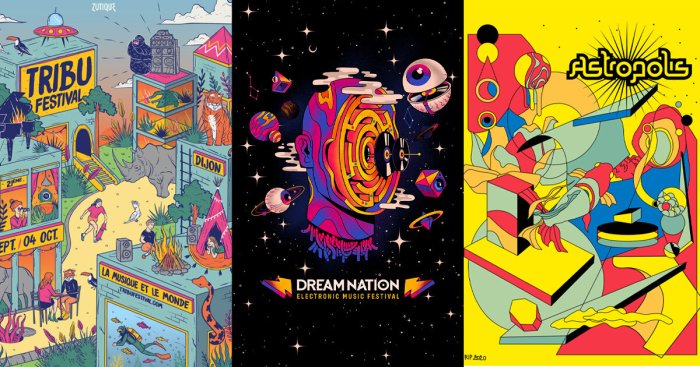
Music festival poster design is a constantly evolving landscape, reflecting the dynamism of the music industry itself and the ever-changing preferences of its audiences. The shift towards digital platforms and the increasing sophistication of design software have dramatically altered the aesthetic and production methods employed, leading to a surge in creativity and visual innovation. This section will explore some of the key trends shaping the modern music festival poster.
The digital revolution has empowered designers to experiment with styles and techniques previously unimaginable. Gone are the days of solely relying on traditional print methods; digital art, illustration, and animation are now integral components of compelling festival poster designs. This allows for a level of detail and visual complexity that surpasses traditional techniques, while also providing greater flexibility in terms of dissemination and adaptation across different media platforms.
The Rise of Digital Art and Illustration
Digital art forms the backbone of many contemporary music festival posters. Software like Adobe Photoshop and Illustrator, along with specialized digital painting programs, allows for intricate detail, photorealistic effects, or bold, stylized visuals. We see a prevalent use of vibrant color palettes, often incorporating gradients and textures to create depth and visual interest. For example, imagine a poster featuring a hyperrealistic rendering of a musician silhouetted against a swirling nebula of vibrant colors, achieved through advanced digital painting techniques.
The effect is both captivating and evocative of the immersive experience promised by the festival itself. Another example could be a poster using vector graphics to create a bold, geometric design incorporating the festival’s logo and key imagery, offering a clean and modern aesthetic easily adaptable for various social media platforms.
Animation and Motion Graphics in Poster Design
The incorporation of animation and motion graphics is pushing the boundaries of music festival poster design even further. While static posters remain crucial, animated versions—often short looping videos—are increasingly used on social media and websites to capture attention and generate excitement. These animated posters might feature morphing shapes, pulsating colors, or even short clips of the festival’s performers. This dynamic approach leverages the power of movement to create a more engaging and memorable visual experience.
Think of a poster where the festival logo animates, perhaps expanding outwards to reveal the lineup or key dates. The impact of such moving imagery is undeniable in grabbing attention within the cluttered online environment.
Social Media’s Influence on Design and Dissemination
Social media platforms have fundamentally altered how music festival posters are designed and shared. Designers now consider the square format of Instagram and the various aspect ratios of other platforms when creating their visuals. The need for instantly recognizable and shareable imagery has become paramount. Posters are often designed with a strong emphasis on concise messaging and visually striking elements that translate well to smaller screens.
The use of bold typography, impactful imagery, and a clear call to action are crucial for effective dissemination on social media. Furthermore, the feedback and engagement generated on social media can inform design choices, allowing for a more responsive and audience-centric approach to poster creation. For instance, a festival might A/B test different poster designs on social media to gauge which one resonates best with its target audience.
This data-driven approach ensures that the final design is optimized for maximum impact and engagement.
Ultimately, the effectiveness of a music festival poster hinges on a harmonious blend of historical context, design principles, and a deep understanding of the target audience. By mastering the art of visual communication—through typography, imagery, and color—designers can create posters that not only inform but also inspire, transforming a simple advertisement into a captivating piece of art that encapsulates the energy and excitement of the festival itself.
The power of a well-designed poster extends far beyond simply conveying information; it creates a lasting impression and fuels the anticipation for the event.